Wallpaper style is evolving.
Instead of a feature wall with bold patterns, today’s approach is more considered. It’s about balance, proportion, and choosing designs that work within the space rather than dominate it.
This guide breaks down how to use wallpaper in a way that feels current, clean, intentional and refined.
For refined wallpaper start with texture, not pattern
-
Denim
$ 211.00Select options This product has multiple variants. The options may be chosen on the product page -
Tweed
$ 250.00Select options This product has multiple variants. The options may be chosen on the product page
Where this works best:
- When covering all the walls in a room
- Bedrooms
- In a room with lots of furnishings or other patterns
Use Feature Walls Strategically
A refined interior doesn’t mean using less wallpaper, it means using it in the right place.
Feature walls work best when:
- You are aiming to draw the eye to a specific location for example to lengthen a room
- It feels like it serves a purpose, for example a faux effect wallpaper such a timber or brick on an external wall or above a fireplace
- You are using the wallpaper in place of artwork
When to wallpaper the whole room
A very contemporary way to use wallpaper which has become very popular is to hang wallpaper on all the walls in a room.
In order to keep this look refined it will depend on what room you are decorating. A living space or a bedroom is best suited to plain or understated patterns such as Traces or Texere. These add texture with neutral patterns that are easier to match with other soft furnishings.
But if you are redecorating a powder room or a kitchen which has smaller walls you might go with slightly bolder designs like Urtica or Ornament they have a smaller pattern that won’t overwhelm the space.
-
Ornament
$ 236.00Select options This product has multiple variants. The options may be chosen on the product page -
Texere
$ 374.00Select options This product has multiple variants. The options may be chosen on the product page
What comes first; the wallpaper or the furniture?
The short answer is wallpaper because in many situations it is the key feature from which you layer.
This makes sense when:
- Wallpaper has more visual impact than the furniture
- It sets the colour palette and overall tone
- You are creating the scene with a feature wall
However furniture can also come first.
This makes sense when:
- You’ve already invested in key pieces (chair, bedhead, cabinetry)
- The furniture is bold or highly specific in colour/style
- You’re going for a more subtle wallpaper
In this case, wallpaper becomes the supporting element, not the feature.
The Best Approach (that designers actually do)
They set a direction, vibe or theme first. For example the home may be a Scandi style
- Pick a wallpaper style around that (e.g. textured, timber look)
- Then choose furniture that complements that style
- Or lock in one key furniture piece and build around that
What colours are refined?
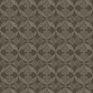
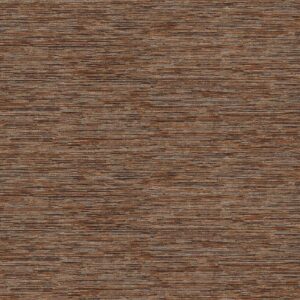
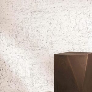
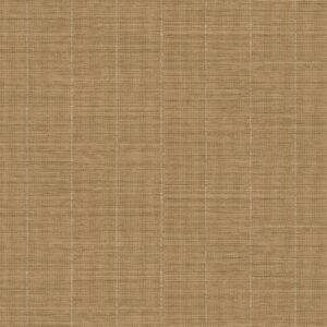
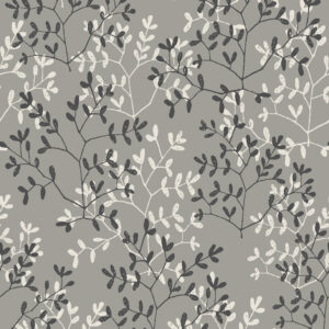
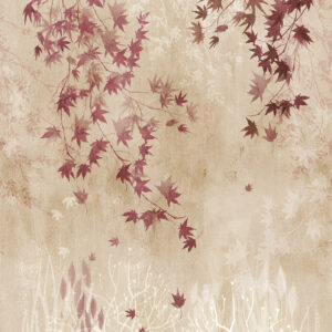
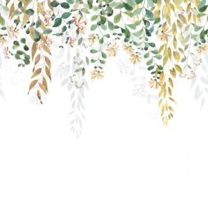
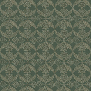
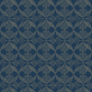
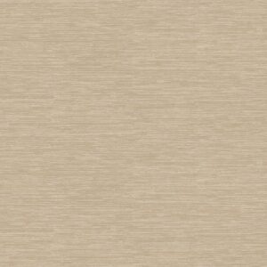
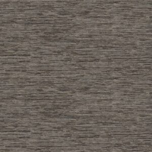
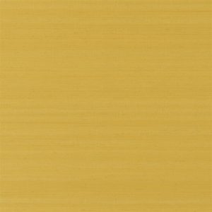
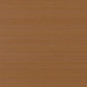
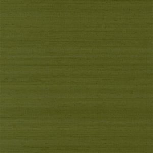
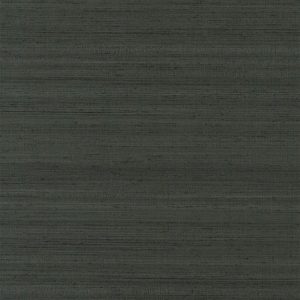
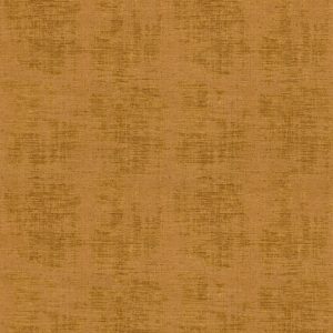
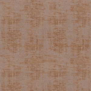
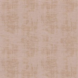
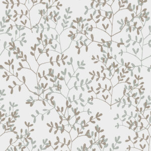
Refinement isn’t about one perfect colour, it’s about controlled, restrained palettes and balance. It’s about how colour behaves in a space rather than an exact shade.
Here’s a clear breakdown you can actually use for interiors and wallpaper styling:
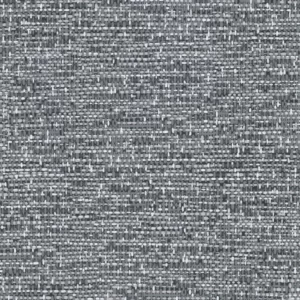
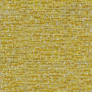
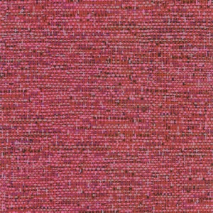
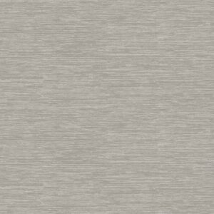
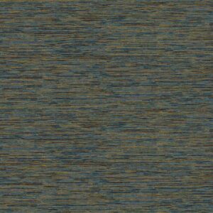
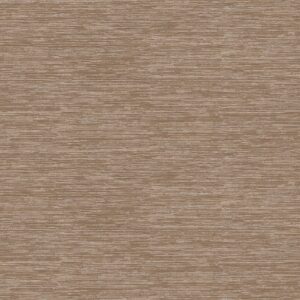
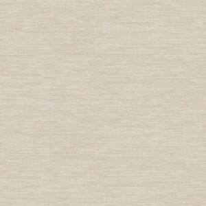
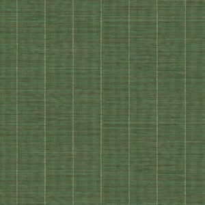
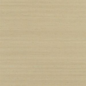
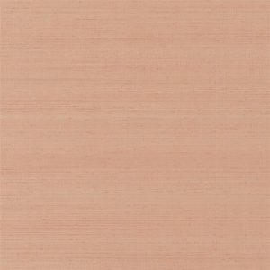
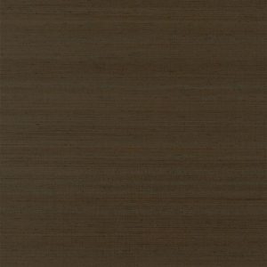
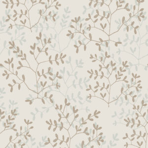
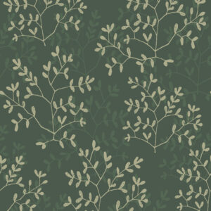
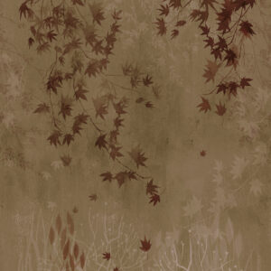
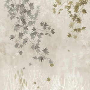
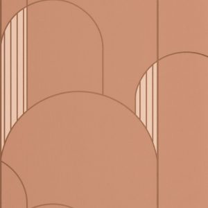
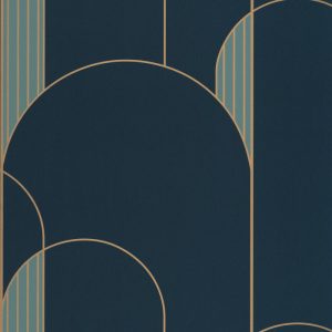
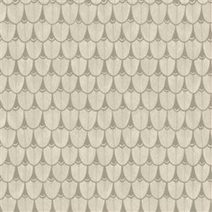
Generally refined colours sit within 3 groups; Soft neutrals, earthy tones, deep and moody.
Soft Neutrals
- Warm whites (not stark bright white)
- Cream, ivory, parchment
- Subtle grey
- Beige tones
Why they work: they won’t compete with other elements in the room, they will support or highlight them.
-
Suber
$ 137.00Add to cart -
Ovala
$ 341.00Select options This product has multiple variants. The options may be chosen on the product page
Earthy Tones
- Olive green
- Sage
- Clay / terracotta (muted, not bright)
- Warm taupe and soft browns
Why they work: they add richness without shouting. These are key in expensive-looking interior design.
-
Safia
$ 385.00Select options This product has multiple variants. The options may be chosen on the product page -
Chinon
$ 493.00Select options This product has multiple variants. The options may be chosen on the product page
Deep and dark
- Navy (not bright royal blue)
- Charcoal (not flat black)
- Deep forest green
- Aubergine or muted plum
Why they work: they create contrast and grounding but only feel refined when balanced with light space or used in the right room with the right balancing features such as light fittings.
-
Feathers
$ 624.00Select options This product has multiple variants. The options may be chosen on the product page -
Johara
$ 363.00Select options This product has multiple variants. The options may be chosen on the product page
Understanding when to go light or dark
Knowing when to go muted and light and when to go deep and moody is not only about the effect you are looking to create. Also to take into consideration is; the natural light, the size of the room and the ceiling height.
- Dark wallpaper in low ceilings can make a room feel smaller and enclosed
- Dark wallpaper in high ceilings can make a room feel grounded especially when using the right wall for a feature
- Light wallpaper keeps spaces open
How to choose refined wallpaper patterns
Unpatterned texture is the obvious go to. However that is not to say that patterns are not refined.
Small scale repetitive patterns are also very classy. Some examples would be:
- Small traditional geometric trellis designs
- Small or delicate florals
- Tone on tone colour
-
Branches
$ 236.00Select options This product has multiple variants. The options may be chosen on the product page -
Woodland
$ 264.00Select options This product has multiple variants. The options may be chosen on the product page -
Cotton Flower
$ 264.00Select options This product has multiple variants. The options may be chosen on the product page -
Alma
$ 260.00Select options This product has multiple variants. The options may be chosen on the product page
Other refined wallpaper patterns include; controlled botanical design.
Examples:
- Soft trailing florals (like wisteria-style designs)
- Vertical botanicals (trees, stems, light foliage)
- Heritage florals in muted colourways
- Balanced natural motifs with spacing
These feel refined because they are not shouting for attention in the room. Avoid busy dense floral designs.
Also structured geometric repeats as long as they are ordered and predictable not abstract.
Examples:
- Linear grids
- Symmetrical, evenly spaced motifs
- Architectural-inspired patterns
-
Nature
$ 212.00Select options This product has multiple variants. The options may be chosen on the product page -
Honeysuckle
$ 587.00Select options This product has multiple variants. The options may be chosen on the product page -
High Walls
$ 245.00Select options This product has multiple variants. The options may be chosen on the product page -
Narina
$ 288.00Select options This product has multiple variants. The options may be chosen on the product page
Patterns that are not refined:
- Oversized chaotic prints with no negative space
- High-contrast, loud colour combinations
- Very dense, busy repeating florals
- Anything that competes with furniture or architecture
Final thoughts
Using wallpaper in a modern, refined way comes down to four things:
- Placement
- Colour
- Balance
- Pattern
Get these right, and wallpaper becomes one of the easiest ways to ensure your space feels considered and not overdone.
You want to notice a room first as atmosphere, then notice the decor, wallpaper and elements that create the atmosphere.


